
Rebranding the Financial Times Podcast Suite to Elevate Their Audio Identity
The Financial Times has one of the most recognizable visual identities in media. Salmon paper. Serious type. A century of editorial authority. So when they asked me to redesign their entire podcast suite, ten shows under one cohesive brand, the challenge was holding two things at once: making each show feel distinct, while making all of them feel like they lived under the same brand roof.
How Good Projects Find You
It all started with a piece of writing that found the right reader. I published this article about designing podcast cover art in 2023 and it slowly grew into my most read article, by far. By late 2024, as that post had quietly carved out a niche corner of the internet, I got a message from the Financial Times’ audio team. They liked my work and wanted to talk.
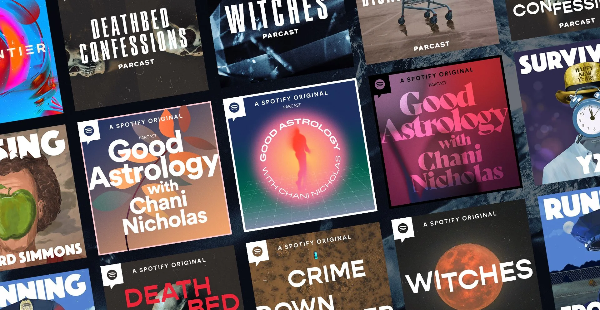
What resonated was a combination of things: my independent studio work (Missing Richard Simmons, the “Ave Maria Bamford” comedy special, etc), but also my time at Spotify, where I worked on podcast visual identity that was designed to operate under a larger brand system. This was exactly the experience this project needed.
The brief was substantial: a full redesign of ten FT podcasts, along with platform assets, channel branding, and marketing materials. We needed to think not just about how each show should stand alone, but how the entire slate looked together as a unified group. Here’s what the previous slate looked like, where each show could stand on its own, but together they didn’t sit comfortably.
…Read the full article on Medium!